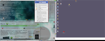
Terminus 12pt bold font
I really like the terminus font at 12 point (x-11/terminus-font), but I was not happy with the lack of bold for this font at the smallest size. I understand why the author did not include one. His whole purpose is to maximize readability, and the bold at this size reduces readability somewhat. Nevertheless, I wanted bold. So I made my own bold version of the 12-point terminus font. You can get it here.

Comments